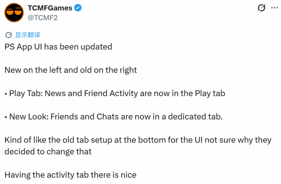
Sony just rolled out a new look for the PS App, and let's just say... not everyone's thrilled.
The redesign reshuffles the mobile app's layout in some pretty noticeable ways. The big change? News and friend activity now live together under a single "Play" tab, while your friends list and chat get their own separate tabs. The bottom navigation bar also returns to an older-style tab layout that longtime users might recognize.
Well-known gaming blogger TCMFGames shared side-by-side screenshots of the old and new interfaces, sparking a wave of discussion. The blogger actually liked one part of the change: giving friend activity its own dedicated space. But they also questioned whether the overhaul was really necessary in the first place.
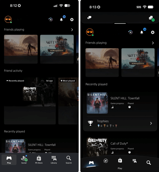
And judging by the reaction overseas, plenty of players are asking the same thing — except with a lot less diplomacy. The comments have been brutal, with many calling the new design a visual downgrade. Some say it feels generic, stripped of the personality that used to make Sony's interface stand out. Others put it bluntly: it's uglier than before.
So what's actually different? The shift brings the app closer to a more standardized, streamlined look — the kind you might see in plenty of other apps. For some, that's fine. For others, it's exactly the problem. Sony's software has often had a distinct feel, and this update trades some of that character for a cleaner, more uniform layout.
It's worth noting this is purely a visual and organizational change. The core features — checking news, seeing what your friends are playing, jumping into chats — are all still there. They're just arranged differently. Whether that arrangement feels intuitive or annoying probably depends on how you use the app day to day.

Of course, UI debates are nothing new in gaming. Every platform update seems to split the community, and "they ruined it" is practically a tradition at this point. But the volume of pushback here suggests Sony might have missed the mark with at least part of its user base.
So, where do you land? Did Sony fumble the redesign, or are people overreacting to a few moved buttons? Drop your take in the comments — we're curious which version you'd pick.
Comments (0)
Log in to join the discussion
Log InNo comments yet