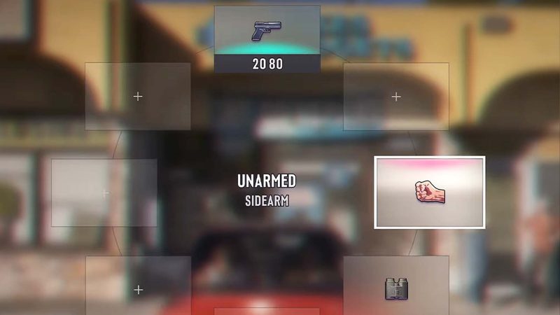
Ever booted up a game and immediately felt at home—or instantly annoyed—by the menus? That's the vibe with GTA 6 right now. The game's UI has become the talk of the town, and players are picking sides.
Some fans are loving the clean, minimalist look. They say it's a breath of fresh air compared to the cluttered screens of other AAA titles. But others? They're calling it 'undercooked' and 'boring.' One Reddit thread even sparked a full-on debate: Is the UI simple and clean, or terrible and cheap?
The screenshots in question come from the latest trailer, and they show a bare-bones HUD—minimal icons, neat fonts, and not much else. For some, that's a win. "Finally, a UI that doesn't look like a Christmas tree," one fan joked. But the critics argue it lacks personality. "It looks like a placeholder," another user shot back.
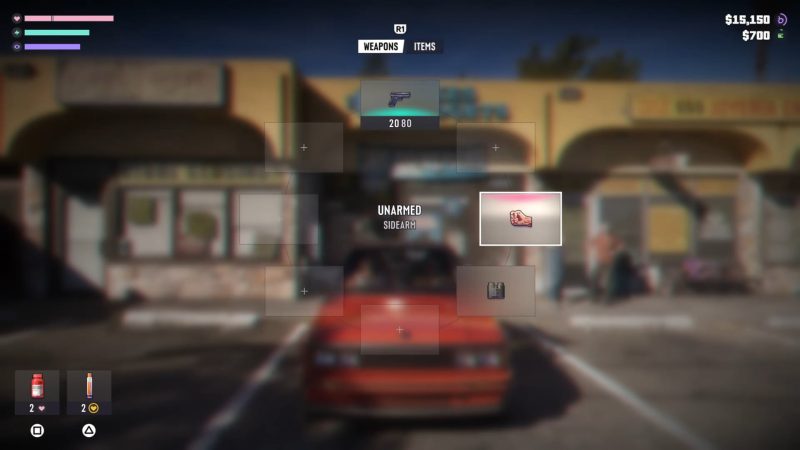
Here's the thing: Rockstar has always had a knack for sleek, functional UIs—remember the minimalist style in GTA 5? But this time, the simplicity feels different. It's almost Apple-like in its cleanliness, which could be a deliberate choice to let the world shine. Or it could be a sign that the game is still in development and the final UI will be more polished.
Let's not forget, GTA 6 is still a ways off, and what we've seen might not be the final product. Rockstar is known for iterating right up to launch. So maybe the 'boring' UI is just a placeholder for something more stylish down the line.
But here's the real question: Does a UI make or break a game? Sure, you'll see it every time you pause, but if the gameplay is solid, does it matter? Some of the greatest games ever had simple UIs, and nobody complained. It's all about execution.
So, what do you think? Is GTA 6's UI too simple and boring, or is it a breath of fresh air? Will you be picking this up on day one regardless? Drop your thoughts in the comments—we're curious to see where you land!
Comments (0)
Log in to join the discussion
Log InNo comments yet